Go with the user flow: how to master UX in 2023
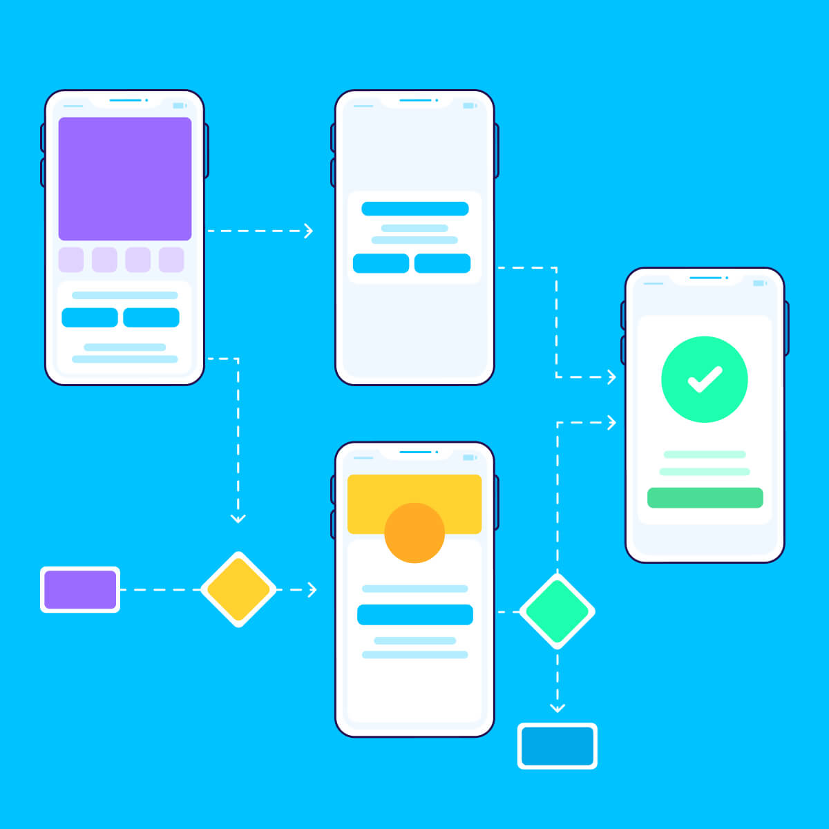
User flow is the typical pathway a user takes on an app or website to complete their task, often represented as a flowchart.
What is user flow?
User flows are maps that portray users’ navigations through different screens and features on an app or website — in order to achieve a goal.
This is the foundational step when designing an app or website, which begins with rigorous user testing. The data informs how many screens you need, in what order you should show them, and what elements you need to help each user get to where they need to be.
Often displayed as a flowchart, every user flow begins with one entry point and shows each action that is taken throughout a session.
Design and product teams utilize user flows to nail down how to improve the user experience by focusing on the user’s needs and behaviors in every stage of their session.
But before we get too deep into the weeds, let’s go over some common terminology.
User flow vs. user journey
A user flow is a visual representation of how a typical user may navigate an app or website.
A user journey, on the flip side, dives deeper into the psychology of this journey by focusing on the user’s pain points, feelings, and expectations, which is a more of a holistic visualization of how an app or website is experienced throughout the session.
User journeys are used to paint a picture of the user experience, which in turn helps make clearer design decisions by putting human usability at the forefront.

User flow vs. task flow
A task flow is a one-path flowchart to measure how one specific task is achieved. It’s often very simple and one-directional, and used for smaller features within a website or app (e.g. the experience of adding an item to your cart).
Why do we use user flows?
Everyone knows what a desk looks like but have you tried building an Ikea desk without instructions? With hundreds of loose screws and planks, you’ll spend hours breaking, fixing, and forcing the wrong pieces together.
Same goes with apps and websites. Knowing what a website or app looks like is not enough.
You need research-backed user flows to provide the architecture to make a website or app optimized for what it was built for. But the benefits don’t stop there.
Work collaboratively with teams
User flows provide a framework to help make better design decisions internally and externally for every stakeholder involved. That could be partners, bosses, investors, and colleagues.
And instead of relying on gut-feel, the detailed diagrams effectively communicate what you’re building out and why you’re building it.
Make iterative improvements easier
In the same vein, user flows make it easier to plan for the future. By focusing on each stage of the flow, you can finetune pain points and refine them as you go.
Let’s say your conversion rates are dropping during checkout. You can easily choose that part of the user journey to test, iterate, and optimize for the future.
User-first design
Instead of focusing your resources on the latest design trends, user flows focus on the user and their behaviors. It’s driven by data rather than preference, which helps design teams stay on track and ensure they’re providing the best user experience possible for their core users, rather than getting sidetracked with fancy gadgets and gizmos.
What does a user flow diagram/chart look like?
The best place to start is by writing out what a hypothetical user would do when they use your app:
- User opens an app
- Clicks their notification window
- Clicks on the highest priority notification
- Scrolls through the feed
- Finds an item they’re interested in
- Adds that item to their cart and navigates to the cart page
- Navigates to checkout
- Types in address and payment information
- Pays and sees confirmation page
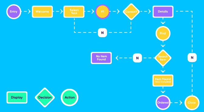
A user flow is visually represented in a flow diagram or chart that looks something like this:
How to create a user flow
Anyone can arrange some triangles, rectangles, and circles to create a basic flowchart. But an effective user flow is rooted in research and attention to detail.
Here’s how you can get started:
1 – Research your customers & competitors
The very first and most important step is to fully understand your customer, which starts with user research.
If you already have a customer base, consider sending out surveys or interviewing them to ultimately put together a user persona, which is an archetypal user whose goals and characteristics represent the needs and behaviors of your user base.
This will help you focus on your real target audience instead of relying on your own assumptions.
The next step would be to analyze what your competitors are doing. Take notes about what they’re executing well and what they can improve on. This will help identify any white space for you to build out your competitive edge.
The more you invest in the research phase, the more likely you are to successfully build a positive user experience while minimizing costly development mistakes.
2 – Set your goals
Now, it’s time to identify your high level goals. Are you trying to drive a sale? Or are you trying to keep users on the platform and stay engaged for a long period of time? This high-level goal setting will drive all future design decisions towards one, focused KPI.
3 – List out all steps a user can take within your website or app
If you aren’t sure where to start, begin by answering the following questions:
- What is the user trying to accomplish?
- What is important to the user and what will give them confidence to continue?
- What barriers may prevent a user from accomplishing their goal?
- What information does the user need to get that done as smoothly and as easily as possible?
4 – Choose a user flow design
Now that you have all your pieces in place, it’s finally time to bring it all together. Choose a mind mapping tool like Figma, Miro, XMind, or Axure to begin your design process. Then create a legend or key that labels what every color and shape represents.
Next, set an entry point like a login screen or homepage. Similarly, set a clear resolution of where a user achieves their goal.
To avoid overwhelm, remember to keep it simple for starters. Once you have a clearly defined flow, add screens to provide your stakeholders a clearer overview of what you’re building.
Best practices: Checklist to improve your user flow
We’ve covered all the bases for you to create your very first user flow. Here are some best practices to keep in mind to make sure you’re putting your best foot forward.
Less is more
Don’t go overboard with the colors, shapes, and symbols. Keep one goal in mind per flow, and make sure the flow goes in one linear direction.
Use a descriptive name and have a clear legend to make it understandable for all potential stakeholders involved. Extra labels and simple color coding also go a long way — so don’t make it look like a coloring book.
Be iterative and collaborative
In every stage of the design process, check in to see how every decision aligns with your primary KPI.
If you have an existing product, utilize screenshots and mocks to help the visual process.
Also, be sure to use your flow to your advantage. Clearly communicate and collaborate with your colleagues to hypothesize how users will behave.
Always be testing
Constant testing allows you to make clear and objective design decisions and improvements without relying on personal preferences, biases, and gut feeling.
A/B testing your site or app is an excellent way to validate hypotheses. Its purpose is to use data to compare two different versions of the same website or app to see which one performs better.
For every test, be sure to keep three things in mind:
- Is it feasible? How difficult is it to make the necessary changes?
- Is it impactful? Will the effort make a significant improvement?
- Are we aligned with our KPIs? Do these changes help bring us closer to our end goal?
Don’t forget that tests fail all the time, but there’s always something to learn from failing. It shows that your hypothesis was wrong and validates your initial design choices were the right ones!
Validate everything
While your user flow may look good in theory, it’s essential to validate it. Consider utilizing usability testing sessions and data gathered from your app analytics to ensure the user journey is applicable to a realistic experience.
Usability testing sessions involve a facilitator that assigns a task to a participant to see if users are actually taking the desired action within your user flow.
Real user flow examples
Curious to see what real user flows look like? There are several approaches, depending on your niche and platform. Here are a few examples to inspire you:
Travel website user flow
This user flow created by designer Jiiia is for a flight search site where the end goal is to get a user to book their tickets.
As you can see, there is a clear entry point at the top that splits off into three possible actions, with all paths eventually leading to the end goal of completing their purchase.
Health app for Apple Watch user flow
Designing for Apple Watch is a unique design challenge because of the lack of screen space.
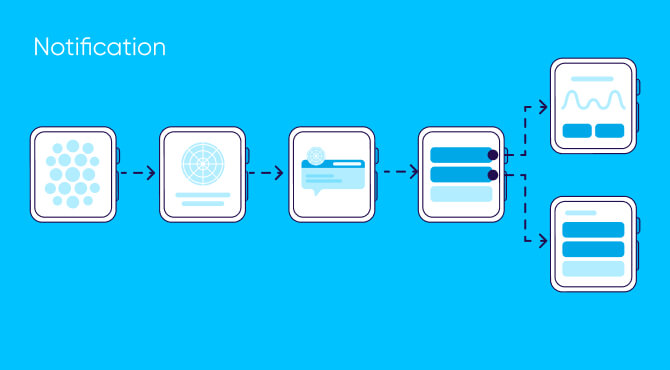
This simple user flow by Marian Mota lays out the steps to read notifications and quickly send messages. The copy is short and the screens are detailed, which makes it incredibly easy to digest.
Spotify user flow
Created by designer Kevin Santos, this user flow reimagines a new feature to chat, vote, and control music in a live setting with friends.
It contains all the necessary elements including a clear legend, one entry point, a linear pathway, and actions that lead to one clear outcome: increasing meaningful engagement.
Key takeaways
- User flows depict how users navigate through different screens and features of an app or website.
- Great user flows are the result of presenting the right information at the right time while minimizing friction.
- User journeys explore the psychology of this journey by focusing on the needs, feelings, and expectations of the users.
- User flows focus on the user and their behavior rather than personal preference, biases, or following the latest design trends.
- Create user flows by investing in customer research, scoping out competition, setting clear goals, listing out all potential actions, and deciding on a clear user flow design.


