5 ways to increase ATT opt-in rates

iOS 14 is the biggest single change to privacy in the mobile era, shifting privacy control away from apps and onto the users.
With that additional control, users are left asking why they should consider giving access to their data – and the onus is on the apps to show the value.
Apple’s AppTracking Transparency (ATT) framework is one of the pillars of iOS 14. It requires a user to give – or deny – access to their unique device identifier (IDFA). App owners no longer have access to the IDFA by default: it is an opt-in mechanism which means they must request permission via a prompt that spells out how a user’s data will be used.
Apps may choose not to pursue the IDFA, and instead focus on aggregated attribution via SKAdNetwork. However, there are a range of benefits to gaining user opt-in, like optimizing SKAdNetwork data with user-level data and driving the highest returns across a wide variety of activities.
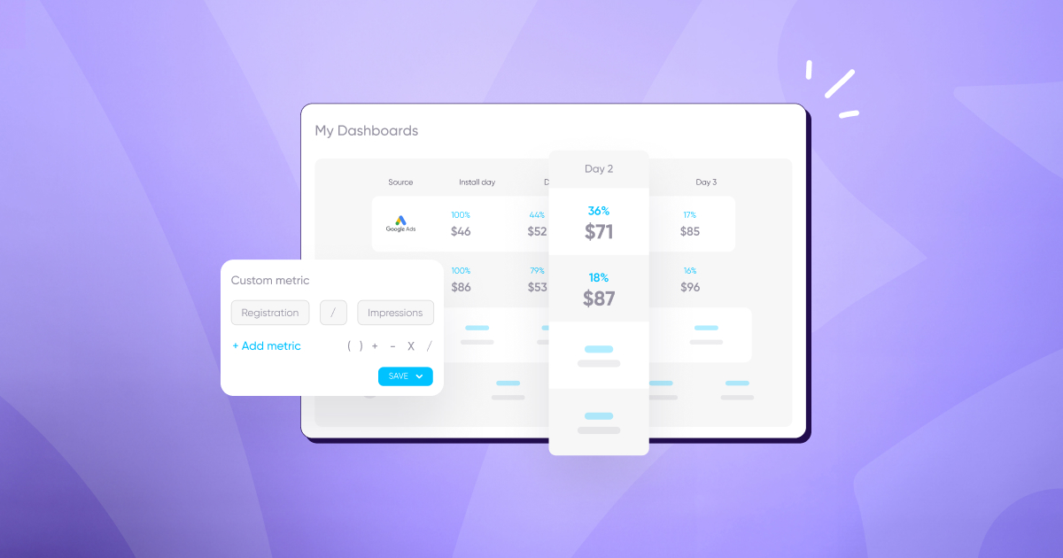
So far, ATT opt-in rates have been higher than many initially thought prior to the iOS 14.5 rollout. They currently range between 30% and 40% on the advertiser side — see regularly updated data in this interactive dashboard with opt-in rates on left hand side:

Driving opt-in rates even higher should be the priority for app developers and marketers in the coming weeks and months.
Clearly, there’s lots of work that can be done here to boost that rate higher. In this post, we’ll examine 5 ways to increase your ATT opt-in rates, and reap the rewards of greater quantities of user level data and attribution.
1. Customize the purpose string in the ATT prompt
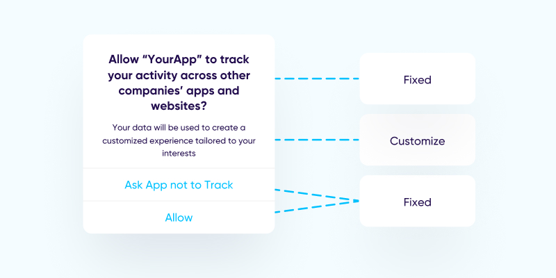
Although the first part of the text string in the ATT prompt is set in stone by Apple, you do have scope to customize the second part – a move you should absolutely make. This is your chance to allay any fears users may have over privacy concerns, and explain the value of opting in.

Make sure users understand the benefits of opting in
It’s safe to assume that the majority of users who opt out of ‘tracking’ do so because of a worry about how their data will be collected, stored, shared, and used.
The purpose string lets you be honest and transparent with your audience. After all, there is a value exchange at play here. Granting IDFA access allows you to provide those users with a better, more curated experience.
Don’t take it for granted that your users are aware of this fact – make sure they know. User benefits of sharing the IDFA can include:
- A customized and personalized user experience
- Curated ads that are more likely to be relevant to each individual (ads will still be shown to users, they just won’t be relevant in any way)
- Improved social features, such as connecting a user with their friends
- Improved fraud detection
- Other personalized in-app content for a better, smoother user experience

In just a few short sentences, you can show your audience that opting in will improve their overall experience with your app.
Build trust with user-focused language
To ensure the customization of your purpose string is effective, you need to put yourself into the mindset of your users. By employing user-focussed language in your prompt, you’ll not only catch your audience’s eye – you’ll build trust and confidence.
The benefits mentioned above have a role to play here. Yes, having users opt-in will theoretically allow an app to thrive and grow its revenue. But so what? Users aren’t interested in what their IDFA can do for you, but rather care more about what your app can do for them.
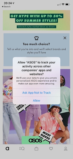
Your prompt needs to frame that user benefit clearly. In the example below, ASOS uses a tone of voice consistent with the rest of their app and target audience, as well as placing the user benefits front-and-center. The goal here is to elevate your prompt and hopefully boost ATT opt-in rates.

Keep it short
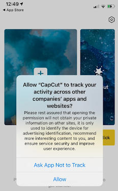
Your users’ time is precious, and they won’t want to waste it reading through a wall of text. Not only will a long prompt reduce the chances of them reading and understanding the benefits to them of opting in, it might also drive them to tap the “Ask App Not to Track” button.
Try to hit all the important benefits in as few words as possible. Prioritize the user benefits that are likely to resonate most strongly with your audience, and front-load them into your purpose string so that they’re among the first things your audience sees.
Avoid words that carry a negative connotation
As a final point on customizing the prompt’s purpose string, be sure to steer clear of language that is likely to resonate negatively with your audience.
Words like “track” or “see” might be seen as intrusive when they’re being attached to a user experience. They may dissuade users from opting in. It’s important to stay honest and transparent in your prompt, but choosing your words carefully can be the difference between a user choosing to opt-in or not.
2. Use a pre-ATT prompt for additional context
Although customization of the ATT prompt itself is limited to just the purpose string, you have other opportunities to communicate and convince users of the benefits of opting in.
A pre-ATT prompt is ideal for giving users the extra information they need. It’s a chance to contextualize what you’re about to ask of them, why you’re doing it, and what’s in it for them.
This is a prompt that is native to your app. In contrast to the actual ATT prompt, with the pre-prompt you can customize:
- Design
- Messaging
- Timing
- What happens next
This means you have total flexibility to make this prompt fit the look and feel of your app, and make it a less intrusive experience for the user. You also control the exact timing of when it is shown (for more on timing, see point 4) and what happens immediately after showing the pre-prompt – ideally, moving the now-primed user straight through to the actual ATT prompt.


You can prepare your users for what comes next with a CTA button like “continue”, so they’re fully aware of the process you’d like them to follow. Make sure that this CTA clearly indicates that there’s another step you’d like your users to take – if it reads something like “allow”, users may (mistakenly) believe that they’ve now opted in.
Remember: you cannot incentivize users to opt-in (eg, a situation where opting in unlocks a specific discount, or a specific in-game item). Nor can you pressure or manipulate them into opting in by gating certain features or functions behind that permission.
3. Use a post-ATT reminder
30% of non-gaming apps had a higher IDFA opt-in rate 7 days after installation compared to being shown the prompt upon launch. Here’s why.
For users who decline to give permission at the ATT prompt, it doesn’t need to be the end of the road. They can still enable permission tracking at any time (and disable it again, if they wish) in their device’s Settings.
Your users might not know this – so give them a reminder. As with the pre-ATT prompt, show engaged users a post-ATT reminder that includes the user benefits of opting in. This prompt can then take them directly to their Settings to opt-in to your app.
There’s the potential to associate this freedom with some impactful, positive messaging. Emphasize that users are in control of their data: they can enable or disable tracking whenever they choose.
This is an opportunity to build trust between app and user. It’s also potentially a motivating factor for users to opt-in with the knowledge that they can change their mind at any time. Make sure this control is clearly communicated in your post-ATT reminder.
4. When to show the ATT prompt
You have control over when to show the ATT prompt (or if to show it at all) – and your decision can have a massive impact on opt-in rates.
After a year of ATT implementation, we found that most apps have had the highest opt-in rates upon first launch. Especially so when shown after a series of app pop-ups in a sequence. Further, there is a 30% drop in opt-ins when shown two hours later.
On the flip side, Food & Drink apps saw higher opt-in rates after 100 minutes, travel apps saw peaks between 30-90 minutes, health and fitness apps peaked at 30 minutes, and hardcore gaming peaked between 50-100 minutes.
This is the tradeoff apps face with regards to the timing of the ATT prompt. There’s no single solution for all apps, and lots of other factors might determine your timing strategy, such as the type of app and how it monetizes. An app that relies on ad revenue as its chief monetization strategy may be best served by showing the prompt prior to the first ad being displayed.
On the other hand, a subscription-based app such as Netflix can show the prompt immediately after signup, as users are given a form of preparation in the actual signup process. For more detail, see our in-depth guide for when to show the ATT prompt.
5. Strong brand affinity leads to user trust
As mentioned above, trust is an important factor in ATT opt-in – just as it is in any brand-consumer relationship. Simply put, the more a user trusts your brand, the greater their willingness to opt-in and allow use of their data.
Driving brand affinity with an app isn’t easy, but with all of the recent shifts towards a more privacy-centric approach it has arguably never been more important. Trust and brand affinity unquestionably gives an advantage to established, well-known brands, for example developers with a stable of entertainment properties such as Activision Blizzard, or companies with a strong high street or ecommerce presence like Nike, Macy’s, and ASOS.
That doesn’t mean all is lost for newer apps or those with less presence. It just means that resources invested in branding campaigns will have an important role to play in gaining ATT opt-in. Consider developing your social presence, cross-promotion in other apps, email marketing, and paid marketing as ways to boost your brand affinity.
Key takeaways
- Customize the ATT prompt purpose string with the dual goals of allaying any user privacy concerns while explaining the value of opting in. Adopt user-focussed language, be honest, transparent and to the point.
- A pre-ATT prompt can provide additional context for users – helping to boost user trust before they receive the ATT prompt itself. The pre-prompt is native to your app, meaning you can – and should – fully customize it to maximize engagement.
- Post-ATT reminders can encourage users who opted out to change their minds. Permission can be given or retracted in Settings at the user’s discretion – this is a positive message of user control, and should be positioned as such within your messaging.
- The timing of the prompt can have a huge impact on opt-in rates. While most apps find the highest opt-in rates when the ATT prompt is shown upon launch, it’s integral to test what works best for your app and audiences — which are unique to you. That said, bear in mind there’s a tradeoff to consider between early campaign optimization and app engagement.
- Brand trust has a bigger role to play than ever now that iOS 14 is here. Apps that command a strong affinity with their users are likely to see higher opt-in rates, purely because users will trust that their data is being used ethically and to their benefit.


