In-app notifications
In-app notifications are messages that creators send to users directly within their app. Styled to fit the platform’s user interface, they appear in the form of fullscreen pop-ups or small overlays.
What are in-app notifications?
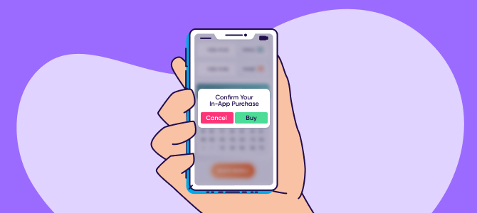
Short messages that app creators send users inside their app to direct them toward specific points of interest. In-app notifications can be used to draw attention to new features, highlight special offers, or better onboard new app users.
By incentivizing and intriguing their attention, you can encourage users forward in their customer journey and your marketing funnel. In turn, this will improve your retention, usage, and lifestyle value.
Marketers also use notifications to deliver rich content like videos and images to keep users engaged with their product and create more targeted user sessions.
A common example of in-app notifications is in-app purchase reminders. Game developers send messages enticing players to buy special weapons, characters, and coins to enhance their playing experience — in exchange for real-world money.
Why in-app notifications are important
In-app notifications are the most effective way of delivering a richer, more robust app experience by segmenting and tailoring marketing efforts to target audiences. Since users are already using the app, seeing a sudden flash of personalized content is more likely to divert their attention.
They don’t hinder user experience or require users to opt-in — nor do they slow down the interface — letting you skillfully engage users and create more valuable app sessions.
Mobile apps that use in-app messaging see up to 3.5x percent higher user retention and 27% more app launches than those that don’t, according to research.
In-app notifications give you the perfect opportunity to ask users to do a specific action. For instance, you can gently guide users to check out your product’s most valuable features and educate them on its benefits.
Marketers use them to learn critical user experience information by asking users to rate their app. They then use the feedback to optimize their user experience, improve their average rating, and eventually lead to more app downloads.
In-app notifications vs. push notifications
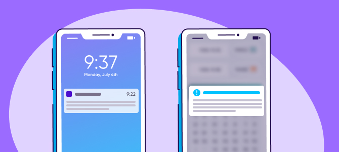
Push notifications are standard mobile messages the user sees without opening the app, typically on their lock screen. Although there are many differences between them and in-app notifications, it’s easy to mix the two concepts.
Let’s identify the main differences between the two:
- Purpose: A push notification works from the outside, bringing an inactive user back to the app. Contrarily, an in-app notification is contextual triggered communication that guides the users inside the app.
- Working Principle: A push notification encourages users to take action at any time, while an in-app notification works only when the app is open.
- Audience: Push notifications targets the potentially disengaged audience whereas in-app notifications are aimed at the active audience.
- Disabling Notifications: Users can always turn off a push notification, but not an in-app notification.
Naturally, the use cases are also different for both types of mobile application notifications. Push notifications are better suited for sending transactional and app updates and notifying users about deals and offers.
In-app notifications, on the other hand, work well for providing users with recommendations, gathering feedback, and onboarding new users.
In-app notifications types
These can come in different shapes and sizes. There’s no one-fits-all format as each app and user needs are different.
Let’s look at the different types:
Notification bars
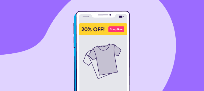
Also known as announcement bars, notification bars are tiny colorful notifications that appear on the top of your screen. These are perfect for informing people about discounts, new services, or product-related updates.
These notifications don’t suddenly pop up on your screen and are already there whenever the user opens your app.
Modals
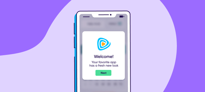
Large in-app notifications that pop up on the screen whenever the user opens your app for the first time — or a specific page. Use modals to notify users of important updates, a necessary user onboarding flow, or to sign up for a new ebook or feature launch.
Tooltips
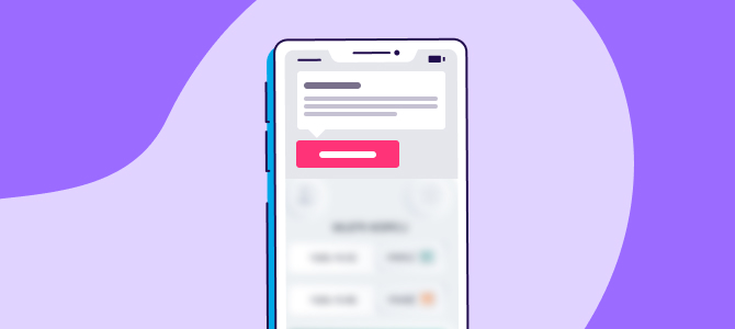
Tooltips are highly contextual, dismissible in-app notifications that let you communicate something quick to the user. Like “Hey, check out this cool new feature!”
A tooltip should be small with a short, engaging copy and a close button. You can use it for a wide range of purposes, including user onboarding, making announcements, and providing updates about new features.
Hotspots
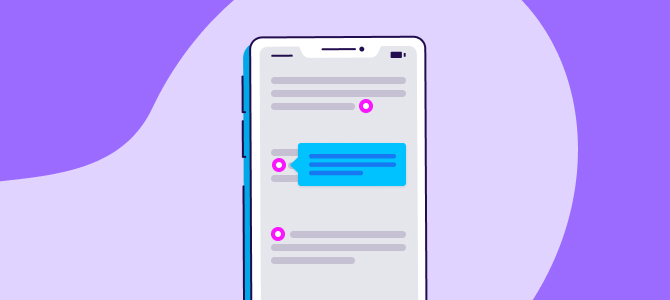
Hotspots are short messages pointed out using a beacon, and are great for signup onboarding flows and/or log-in pages.
When executing this type of in-app notification, ensure the message inside of the beacon is relevant and worth your users’ time to find, click on, and engage with the hotspot.
In-app notifications’ best practices
The most effective in-app notifications feel like helpful guidance — not interruptions. Here are 5 of the best practices to keep in mind when planning your app messaging strategy:
1 – Segmenting different audiences
In-app notifications are all about being at the right time at the right moment. Every user will come out with their own experience, which is why segmentation is king.
Don’t send the same message to every user. Instead, understand your user‘s path and deliver personalized messages based on their specific context. This will help get a favorable response from their end.
2 – Conducting A/B testing
When writing your message, use words that make users feel you strive for their benefit. It should make them believe what you’re telling them is important and will help them enjoy a better user experience. Your tone should also be kind and encouraging.
Another critical aspect here is the right timing. You may have chosen the best words and put them forward in a great tone, but if your timing is bad, your messaging will likely be ignored.
That’s where A/B testing comes into the picture.
Send two different in-app notifications announcing a new feature to two separate groups of users at different times. Give both groups enough time to interact with your message before analyzing the CTR and feature adoption rates.
This will help you understand which messaging resonates best with your audience and what’s the best time to reach out to them.
3 – Experimenting with visual elements
Research suggests posts with images produce a 650% higher engagement rate than text-only posts. So, it makes perfect sense to spice up your in-app notifications with attention-grabbing images or emojis based on the format you use.
When combining text and images, make sure the design is clean. Remember, getting the design right isn’t just about what color, shape, or size your in-app notification will be — it’s also about the type of UX pattern you use.
For example, using emojis would be better if you use a notification bar, but images are more impactful for a modal.
Don’t forget to make your CTA stand out, too! After all, you ultimately want users to take action. Consider making a CTA button in a bold color with a 2-3 word copy inside.
4 – Using geo-based engagement
If you’ve got users in different time zones, cultures, and countries, consider the geolocation information of your consenting users in your in-app marketing campaigns. Sending timely proposals is more likely to interest users and increase conversion.
This is especially useful for businesses with physical locations. For instance, if your store is located nearby, send an in-app notification informing local customers about special offers relevant to that specific location.
5 – Avoiding extra user data requests
Consumers today are reluctant to share their personal data. They may want to write a recommendation or review for your app but refuse to do so at the last moment because they don’t want to give away that email.
So, whenever possible, avoid sending in-app notifications asking users to submit extra information
Key takeaways
- In-app notifications are sent or shown to users while they are actively interacting on an app, making them more likely to engage with your message and take the intended action.
- Due to their tailored style of triggering based on user interaction, in-app notifications create a more seamless progression from an app user’s initial session to the desired conversion.
- Choosing the right UI template is important based on the urgency of the communicated information. Slideouts, tooltips, announcement bars, hotspots, and modals are the most popular types of in-app notifications.
- A/B testing in-app messages will help you determine the right words and tone, as well as test the best time to reach out to users without interrupting their user flow, while maximizing their engagement.


